Improvement Plan


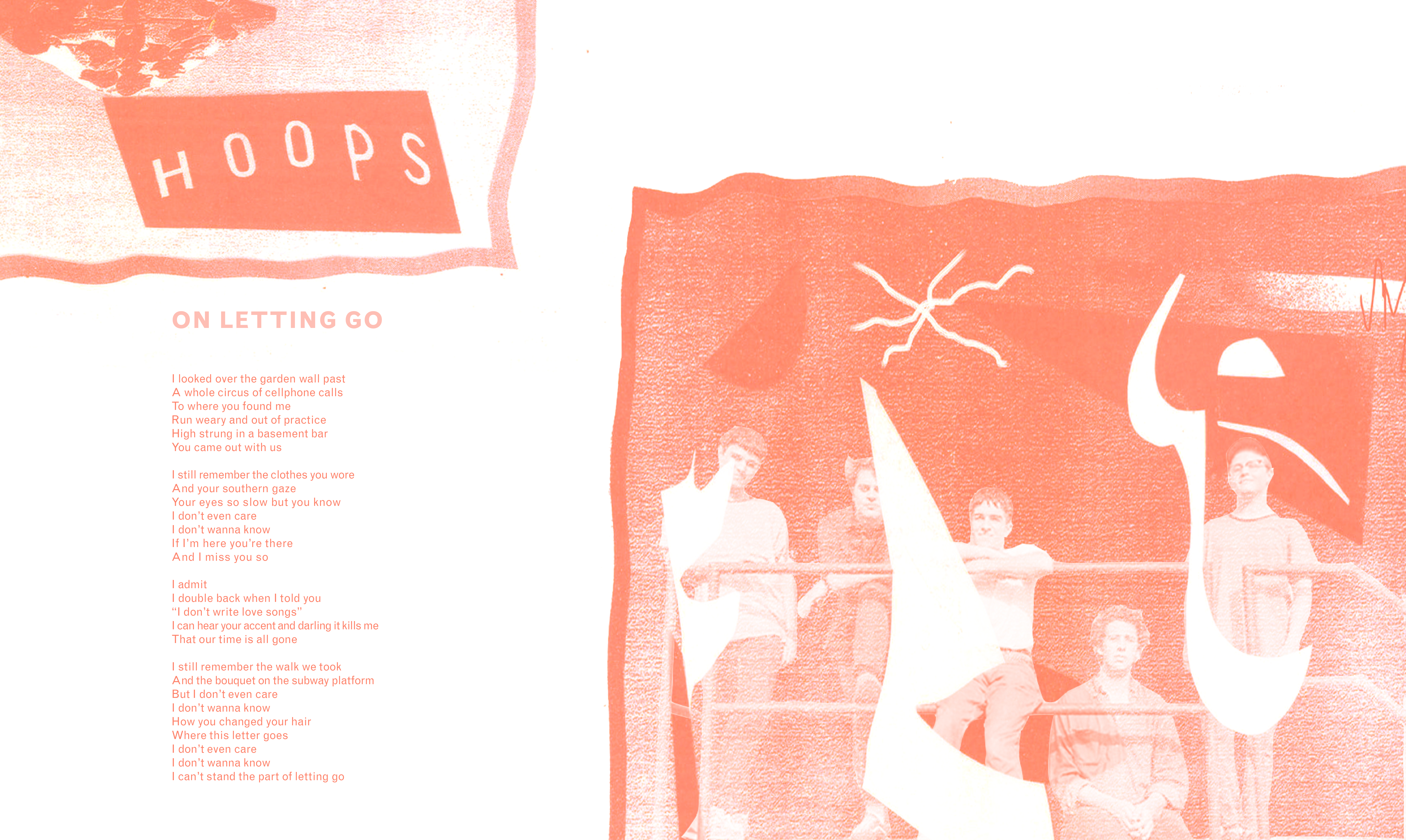
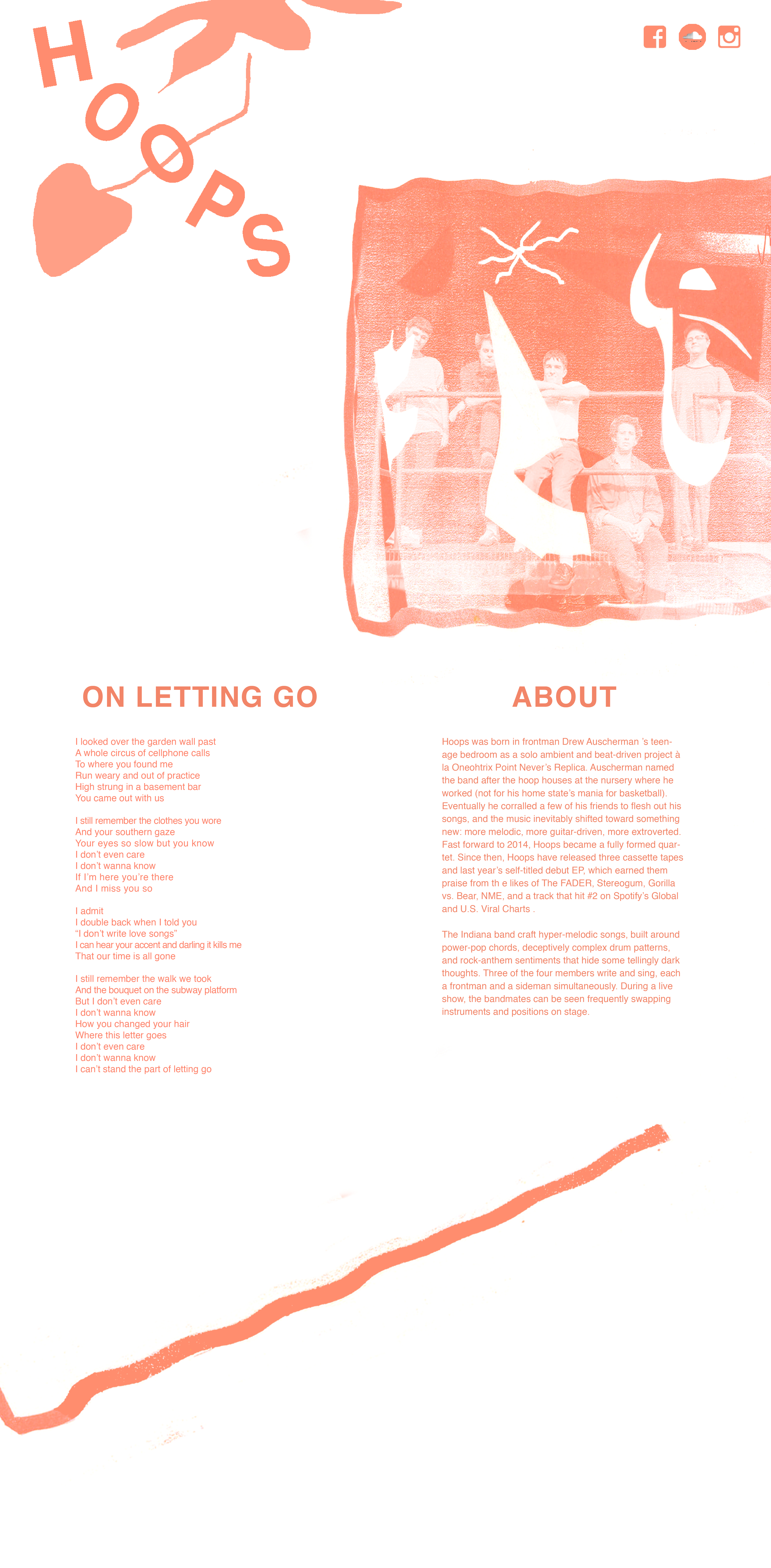
My partners were Tommy Fruhauf and Sarah Pulvirenti. They suggested that I focus more on negative space in my refined mockup and experiment with larger font sizes. They also suggested introducing an additional color into my images/text, which I'm still trying to work out. I decided to increase the font size of the lyrics and their heading title in my second iteration, as well as add an "About" section to give more context to my lyrics page. I think that while I'm moving towards a more refined design, I inadvertently designed this page thinking of a poster instead of a webpage so I still need to learn how to better translate my print oriented design sensibilities to something for the web. I want to play around more with repeated shapes taken from the first image, perhaps add more information (like upcoming tour dates), and vectorize/clean up some of the fuzzier shapes.

